In what ways does your media product use, develop or challenge forms and conventions of real media products?
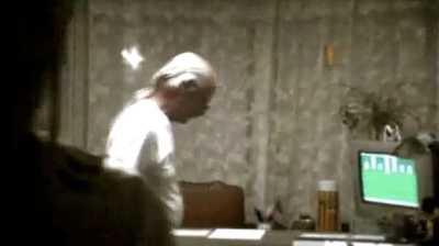
My music video makes extensive use of cuts to the beat of the audio. I researched music videos by popular artists, including Little Motel by Modest Mouse and 9 Crimes by Damien Rice and found that lip syncing was prevalent in most of them. I used this convention by having my actor lip sync the song. In addition, the visuals of my song reflect the song in that the imagery and speed of cuts changes for the closing section of the song, when the tempo increases.
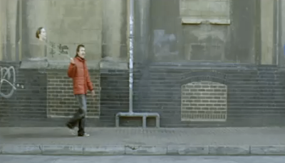
 The main character drinks in the street, highlighting his rebellious attitude.
The main character in my music video, representing the lead singer of the band, has several of Dyer’s common star values applied to him, specifically “youthfulness” from his age and actions within the plot, “rebellion” from the plot of running away from home, an “anti-authoritarian attitude” highlighted in the scene where he decides not to go to school, “aggression/anger” as shown in the scene where the character angrily throws his bottle away and “a disregard for social values relating to drugs” as he is shown drinking underage in a pub and drinking in the street from a bottle of Vodka. He is a constructed image rather than a real person, which is consistent with Dyer’s theory.
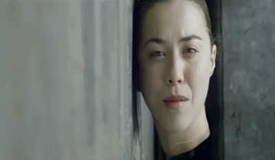
The main character is often shown in an extreme long shot or close up. The extensive use of close up, which is also carried through to the digipak cover, is consistent with Pete Fraser’s theory of camerawork codes and conventions in music video, designed to create an intimate connection between the character and the audience, which was an important connection for me to establish given the sensitive and emotional nature of the character’s story.
 The longest take in the music video was highly emotionally charged.
I challenged the convention of the use of fast cuts, however, as my song was slow paced and so I wanted to use long takes to feel natural with the rhythm of the song. The longest take showed the main character angrily throwing away a bottle of alcohol and breaking down. I felt the use of long take here was important so as to absorb the audience into the actor’s natural and heartfelt performance. This is consistent with Pete Fraser’s theory of music video editing conventions; “There are videos which use slow pace and gentler transitions to establish mood. This is particularly apparent for the work of many female solo artists with a broad audience appeal, such as Dido.”
 The cuts and speed of the camera movement speed up in relation to the music.
I used Andrew Goodwin’s theory of music video forms and conventions to great effect. I fulfilled “there is a relationship between lyrics and visuals” by using a child actor for the main character to reflect the lyrics “children, wake up” and “if the children don’t grow up, our bodies get bigger but our hearts get torn up”. I also fulfilled “there is a relationship between music and visuals” by cutting to a visual blackout when the song reached a mid-point crescendo and warming the colours and increasing the speed of cuts when the song switched from a slow pace to uptempo.
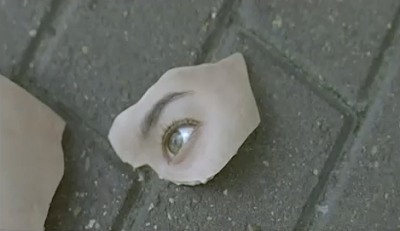
The use of ambiguous images in my narrative is consistent with Steve Archer's theory of repeatability. The audience has a desire to watch the video again to catch what they may have missed and develop their own interpretation of what the images mean.
How effective is the combination of your main product and ancillary texts?
My ancillary texts such as my website and digipak are very closely tied to my main product, retaining imagery, themes and brand identity. I used the same actor throughout my three products in order to establish the star. The shots of the main character behind the bars of his school gate, and his sad lip syncing and happy epilogue shot are used in the digipak to create a tight connection with the video. The artist (Arcade Fire)’s logo is consistent throughout the website and digipak to reinforce a sense of brand identity. The digipak also makes extensive use of road imagery to reinforce the theme of journey and running away that the video makes a strong narrative point of.
After having researched websites for popular artists and bands such as Coldplay, Snow Patrol and Florence and the Machine, I used this research in constructing the layout and content of my website. I included links to the band’s videos, discography and biography. I wrote latest news updates from the band, included links to social media destinations including a Facebook Page and Twitter account and included dates for upcoming gigs. These links to social media destinations was relevant to my target audience and would increase engagement and interactivity. The list of upcoming gigs is used to advertise the artist and encourage the audience to seek them out and spend money. I also established an interactive competition for fans to get involved. The layout of my webpage used established conventions, including a header section with navigation and central content block that remained at a fixed-width.
The front cover of the digipak and the header of the website use the same photo of the character lying down on their apartment floor. This photo was taken during the screen test, so their costume did not match the costume in the music video. This meant that the photo was not very effective and in future I would be sure to keep costume consistent.
My three products were closely connected, with a shared brand identity in the form of logo and primary imagery of the child lying on the ground.
What have you learned from your audience feedback?
From my audience feedback I found that my video was widely well received. Positive comments I received praised the range of shots, clarity of shots and plot, lip syncing, and, in particular, use of lighting. I agree with these positive comments as I had put a lot of effort in the production process to achieve them, especially with regards to the lighting, which I spent many hours colour grading to accomplish. Many did not offer any negative feedback, but comments I did receive focused on the shakiness of the camera, use of blackout and ambiguity in opening and closing scenes. One audience member believed that the shaky camera was distracting and the scene following the main character walking alongside a road could have been improved with a steady dolly shot. However, I disagree with this as throughout my piece I wanted all shots to have some form of moving camera. The steadiest of shots I did not use a tripod, but instead a monopod, because I feel that the narrative of the character running away would not effectively be reflected in the visuals if the camera was completely steady, as that would suggest stopping rather than movement and would slow down the rhythm of my visuals. The handheld style also gave an immediacy and intimacy to my piece.
 The ambiguous visuals drew a mixed response from the audience.
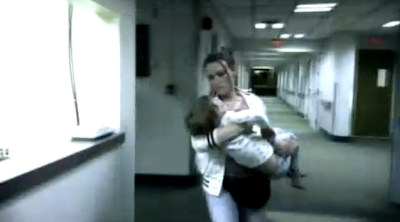
The use of blackout before the closing section of the song was mentioned by an audience member as being too ambiguous and not offering enough explanation for the character’s change of mentality. In addition to this, the shots of a man in the opening scene and a woman and a child in the closing scene in the main character’s house were said to be too ambiguous and confusing. However, it was always my intention from the pre-production process to have ambiguous elements that offer more symbolism than literal plot. I know in my mind who the man, woman and child represent, but I wanted to leave the images of them open to interpretation, as all good art does, to allow the audience to make them represent what is relevant to them. Rather than being a cookie-cutter story of a child running away, the reason why the child runs away and the reason why the child returns is intentionally left vague in my media product. This is consistent with Peter Fraser’s theory of narrative in music video; “Narrative in songs is rarely complete, more often fragmentary, as in poetry. The same is true of music promos, which more often suggest storylines or offer complex fragments of them in non-linear order. In doing this the music video leaves the viewer with the desire to see it again if only to catch the bits missed on first viewing.” I received greatly positive feedback for my “fragmentary” narrative, with one audience member praising my piece for “having a voice” and “nuance”, which I was very proud to hear. By uploading my music video to YouTube, I also received feedback from my fan following that I had developed from previous projects. This gave me an established audience base that I could broadcast my work to. The feedback from this online group was mostly positive, with some negative criticism focusing on the use of lip-syncing by the actor, claiming it looked "unnatural". Within the first week of release it accumulated 3,000 views.
The website that I designed for my artist was also well received, comments praising the framing, layout, imagery and logo and brand consistency. However, negative comments criticised the lack of central placement for the YouTube video embed, small content text size and light drop shadow on the artist logo. I agree about the YouTube video being left aligned rather than central and would improve this. I would also have increased the content text size from 11px to 12px. I do not agree about the drop shadow on the artist’s logo however and would have kept it, because I felt that the clarity from the background was strong enough and would not be difficult to read for most.
My digipak received mixed comments from the audience. Positive comments focused on the font in the artist logo design, contrasting photos of the main character in sad and happy emotions, inclusion of lyrics in the design around the CD slot, the symbolism of the photo of the main character behind the bars of his school gate and clear and contrasting images throughout. I agree with these as, in regards to the symbolism of the gate and the contrasting photos of the character’s emotions, I wanted to achieve a similar level of symbolism and depth from my music video in the digipak design. Negative comments focused on the spines and the lack of clarity of the lyric text around the CD. I intentionally chose for my photos to bleed out into the spines rather than design specific imagery, but I agree with the audience that this could have been improved and I would do if I did this task again. The lyrics around the CD were intended to be subtle and not necessarily legible, so in this instance I would not have altered them.
How did you use new media technologies in the construction and research, planning and evaluation stages?
During my research stage, I used online video websites such as YouTube to stream music videos quickly on my computer. This allowed me access to a large library of music videos from which I could study. To plan for my music video I storyboarded each shot using card and pen, then scanned them into my computer. With these scanned slides, I created an animatic to present them. This involved editing them in Apple’s Final Cut Pro, cutting to the beat of the music, as if I was editing the actual music video itself. I also added zoom ins to achieve a Ken Burns effect in the editing process. This animatic proved valuable in realising the vision I had for my video, and allowing the actor to visualise his character’s journey and understand the wide range of emotional responses the piece would demand. From start to finish, the storyboarding and animatic process took two days.
Prior to shooting I acquired a Canon EOS 7D camera, which is the cutting edge of independent filmmaking technology and was only announced during my pre-production process, so filming was delayed whilst waiting for its release. This DSLR allowed me to use interchangeable lenses to achieve a shallow depth of field in my shots which I felt would give my footage a professional and gorgeous aesthetic. It also gave me the ability to shoot in slow motion which I envisioned right from the storyboarding process for specifically the closing scene of the child returning home. To achieve the slow motion effect I shot at 60 frames-per-second (2.5x the rate of the normal-speed footage) and conformed it back to 24 frames-per-second to match my normal-speed footage using Apple’s Cinema Tools. I then used Adobe’s Premiere Pro CS4 to edit my music video. This involved scrubbing through all of the footage I had captured and selecting clips for the best takes. I then placed them on the timeline and cut them together to match the beat of the music.
 Before colour correction.
 After colour correction.
Once I was happy with the edit, I moved on to colour grading with Magic Bullet’s Mojo software and Adobe’s Lighting Effects. This process was longer than the editing process itself, with each individual shot requiring unique colour correction and lighting effects highlighting the character’s face from the background which, in some shots, had to be key framed to follow his face as it moved throughout the frame. I settled on a thematic aesthetic of warm and Autumn-like, which was very different to the original footage’s bleak aesthetic due to being shot in Winter. As the video progressed, the colours slowly become more desaturated until eventually, in the shot of the character in the car, all is nearly black and white. After returning from blackout, the colours were bright and vibrant, highlighting the orange of the sunset, to represent the character’s rise out of depression.
I designed my digipak and website using Adobe Photoshop. For my digipak I used several layers of different images and manipulated them to create an interesting composite image, for instance the front cover shows the main character lying on a road with double yellow lines shining on top of him as if light. I broke the website design into slices then used my pre-existing web design skills to write the website from scratch in code form in HTML and CSS. After checking that all of my images used relative paths to ensure they worked when the directory was moved, all the files were moved over to my T drive to be sent to the examiner.
For my evaluation I wrote my initial drafts in Microsoft Word and then, when finished, copied and pasted it into my Blogger blog. This meant that I had to write my evaluation in past tense, which was confusing. Once on my blog I also added screenshots to emphasise my points. The use of a blog allowed me to add these multimedia elements such as YouTube video embeds that would not have been possible with a paper folder.


